
It is tempting to rest on your laurels in eCommerce after you achieve a high volume of traffic to your business. After all, it takes a lot of site development and marketing effort to do so. However, having thousands of followers that do not convert does not pay the bills. You still need a strong plan to persuade visitors to buy after they show up.
The following is an overview of helpful strategies and tips for optimizing eCommerce landing pages to win business from your site visitors.
If you have a landing page without visualization, the odds of conversion are low. Even a single image is not necessarily enough. With clothing, decor, and other items, people want to see the product from a variety of perspectives to consider its value.
Use image tools that allow you to share varying angles and visual options. In some cases, products are even more super-powered with a 360-degree perspective or virtual presentation.
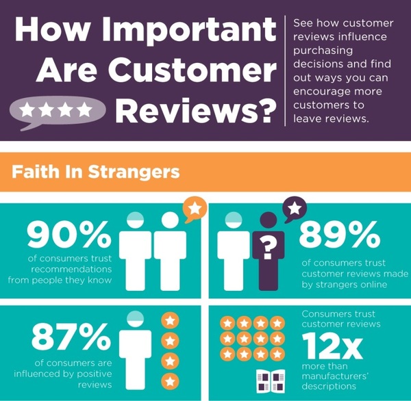
Customer reviews are arguably the most important feature of an optimized product landing page. The following graphic illustrates the power of online reviews. Amazingly, nearly as many people trust the opinions of strangers online as trust the recommendations of people they know.


Source: OccupyGoogle.org
Additionally, consumers are 12 times more likely to believe other customers as they are to believe what product-makers tell them. Eighty-seven percent are influenced by positive reviews. Therefore, delivering quality customer experiences is a priority. You can also help manage the message by encouraging a satisfied customer to complete reviews and following-up after sales to resolve any issues.
Even with great visualization, shoppers still need some to of explanation of value in written form. Creative copy that articulates the ways in which the product resolves a problem or improves quality of life is critical to persuasion.
In a traditional sales meeting, reps know that even after communicating value, they typically have to ask for the order to earn the business. The same logic applies to eSellers. To nudge a prospect toward a purchase, you have to clearly ask for the order.
An effective call-to-action is normally placed after the product description and images, or adjacent to them. It is best practice to create a visual CTA, such as a colorful button that directs the visitor to “Purchase” or “Buy.”
Face-to-face sellers also recognize the importance of inviting buyer questions and concerns. You want to do the same. Whether via link or button, give visitors an option to ask questions about products when they want more specific or customized information. You could also link to FAQ pages of a manufacturer. Chatbots have become more common as a service tool as well. They leverage artificial intelligence to interact with prospects based on on-site behavior.
These are some of the best tips for eSellers to optimize product landing pages to boost conversions. Follow these tips to take advantage of your high traffic volume to generate more revenue!