How to Create eCommerce Landing Pages That *really* Convert
Regardless of the quality of the products and services you sell, or how well you market your business, you won’t succeed in e-commerce without effective landing pages that convert. Your site will simply be a stepping stone in a person’s journey toward the ultimate solution. Design, layout, and content all influence the engagement and response a visitor has with your site, and affect your financial outcomes.
The following is a look at strategies and tips that help eSellers create great landing pages that optimize conversion efficiency and profits.
Design with your marketplace in mind
Often referred to as the “people-based” approach to design, you will convert more if you create landing pages to suit the interests of targeted customers. BounceX reported an increase in conversions of 10 to 15 percent by using this strategy. This mindset is similar to the general business shift away from product-centric activities of decades past to customer-centric operations of today. Building for the customers you want increases the likelihood that your pages appeal to them and drive responses.
Consider the aesthetics, and how they impact the emotional response your typical visitor has. More importantly, focus on the overall user experience. Ask yourself the following questions:
- How quickly can my visitors figure out the value of what is being offered on a given landing page?
- Are category and product pages structured and laid out in a way that simplifies navigation?
- Is it clear to the reader how to transition from learning about a solution of interest to making a purchase?
Identify any pain points between the first entrance to the site and completion of a purchase through your shopping cart. People step out of this process because of impatience or frustration. Eliminate these burdens to your customer experience and pave the way for buying activity.

Focus on the first impression
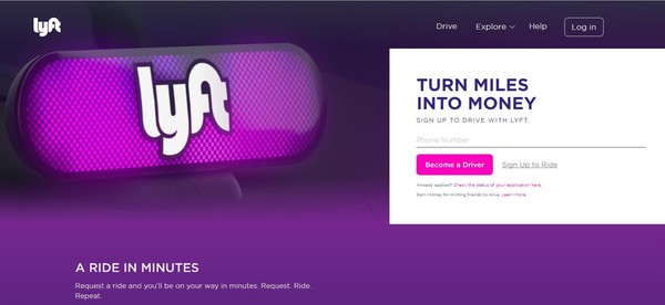
Just as they do when you meet people, first impressions of an e-commerce site carry a lot of weight in overall perception. If a visitor lands on a page and is immediately put off by the look and feel, the odds that you can overcome that and make a sale are minimal. This same point applies when an interviewer is immediately bothered by the dress or manners of a job candidate.
The design and color schemes of your landing pages are major factors in forming visitor first impressions. Use attractive designs that create a consistent brand image for your business. Don’t overwhelm the candidate with clutter. Use enough white space to invite the person to explore the content on the page. Integrate quality images, and videos when possible, that demonstrate the merits of the solutions offered on the particular page.

Offer clear and concise value
The average online shopper visits a brand over nine times before making a purchase. This fact highlights the importance of capturing a customer’s interest right away upon the first visit. If you don’t, that customer will continue to search the web and likely land on another provider.
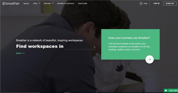
After you achieve the first important step of getting the prospect to your page, offer clear and concise value that prevents him from bouncing. The design and layout schemes already discussed go a long way in creating an inviting experience. Beyond that, deliver a message of value that is efficiently read. If you have a deal or discount promotion, enlarge that with a visual and short message so the buyer knows the value in a few seconds.


Keep it simple
Part of your prospect’s first impression is figuring out whether your landing page and website are simple enough to use. Typically, prospects will bounce and look for another option if their first impression suggests a burdensome experience.
Keep your layout simple; don’t try to jam every possible pitch into the page. A simple layout allows you to more effectively highlight things the buyer cares about, including your brand and what you have to offer, why your solutions are the best possible value and what steps to take to make a purchase.
Give directions and endorsements
To enhance the simplicity of conversion, give directions whenever practical and possible. A pop-up box that invites an intrigued prospect to share contact information after a brief encounter with the site is an option. Ask for contact information or guide the visitor through the site setup process. Use arrows or other visual cues that direct the visitor toward the next step in the buying journey after a brief exploration of the page.
Sharing customer testimonials or endorsements is another way to make the buying decision simpler. A customer testimonial is a third-party statement that can support the benefits and value of given solutions. Include an image, and let the satisfied customer tell the visiting peer why your business is a great fit.
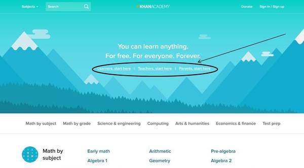

Here’s a zoom-in:


Track customer and product data
Optimizing landing page conversion efficiency is an ongoing pursuit. Don’t just implement strategies and assume you will experience success. Track customer and product data over time and make adjustments based on what the results tell you. Buying behaviors evolve, and what works now may not work as well in the future.
Customer data helps you refine the target for your people-based approach. You might decide to tweak your content and message if the data suggests a different buyer persona that you initially though. Product data helps you figure out which types of pages and products convert.
Perform some A/B testing with different landing page constructs to see how your specific visitors react. As the data rolls in, adjust the low-performing pages to fit with those that deliver better results.
Conclusion
Digital marketing, including content and search engine optimization, helps get people to your e-commerce website. However, eSellers that make a lot of money realize that getting people on site is job one. You have to efficiently convert visitors into buyers, and the quality of your landing pages plays a key role in this step.
Implement the philosophies and strategies discussed to give yourself the best chance to convert prospects consistently. Track your data, though, and adjust to the specific interests and actions of your company’s customers.


