


Product Design @Payoneer—January 2020
The last few months have been jam-packed here in the product design department at Payoneer. Here’s what we’ve learned:
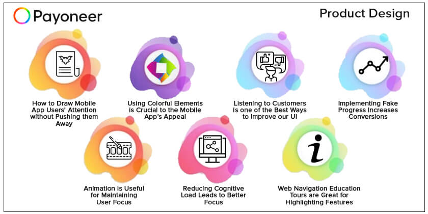
- How to Draw Mobile App Users’ Attention without Pushing them Away
- Using Colorful Elements is Crucial to the Mobile App’s Appeal
- Listening to Customers is one of the Best Ways to Improve our UI
- Implementing Fake Progress Increases Conversions
- Animation is Useful for Maintaining User Focus
- Reducing Cognitive Load Leads to Better Focus
- Web Navigation Education Tours are Great for Highlighting Features
1. How to Draw Mobile App Users’ Attention without Pushing them Away
Let’s say we would like to display an important message to our clients in the Payoneer mobile app and we want them to notice and acknowledge it. Our goal is to create a prominent element that would be noticeable, yet subtle enough to draw the users’ attention without distracting them from the main context.
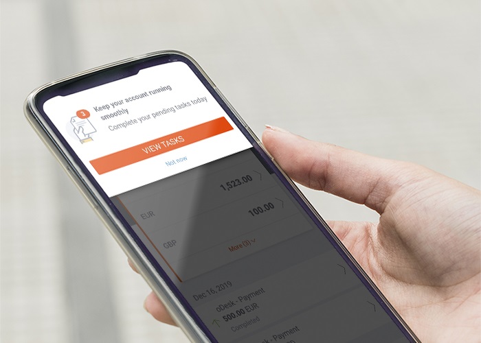
First, the idea is to provide an experience that doesn’t give the user a feeling that they’ve left the page. If we’d created a full-size popup, it would “hijack” the content and the user would immediately search for the “X” button. To avoid this, we show part of the page’s content in the background.
Further, static elements are easy to ignore, which is why the overlay appears on the screen in an animation, to ensure it is noticed. Finally, we provide an “out” – enabling the user to choose to perform the action later rather than forcing them to take action. We provide clear content that enables the user to dismiss the announcement if they choose to.
2. Using Colorful Elements is Crucial to the Mobile App’s Appeal
Usability and aesthetics are two of the most important factors in assessing the overall user experience for an application. The aesthetic usability effect is a user’s tendency to perceive attractive products as more usable. The effect has been observed in several experiments and has significant implications regarding the acceptance, use, and performance of a design.
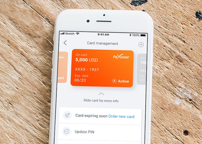
Aesthetics are achieved using a combination of colors, consistent visual layout, and compatible font styles. For example, studies show that apps using a combination of only black and white colors (gray-scale) are less stimulating than apps using colorful elements.
To achieve higher user satisfaction, we applied this principle when designing the new card management section of the Payoneer mobile app. We used a leading, colorful main image a representation of the Payoneer card—and a simple layout of the page.
3. Listening to Customers is one of the Best Ways to Improve our UI
We occasionally receive feedback from our users regarding different UI issues in the Payoneer account. We recently received such feedback from one of our customers regarding their ability to understand the transaction page of a purchase they had made and the refund they should been getting.
The issue was that the purchase and the refund were for the same amount and had the same store name and description. Since the only visual difference between the purchase and the refund was a minus sign next to the refunded amount, the client wasn’t able to spot it and contacted support several times to clarify the issue.
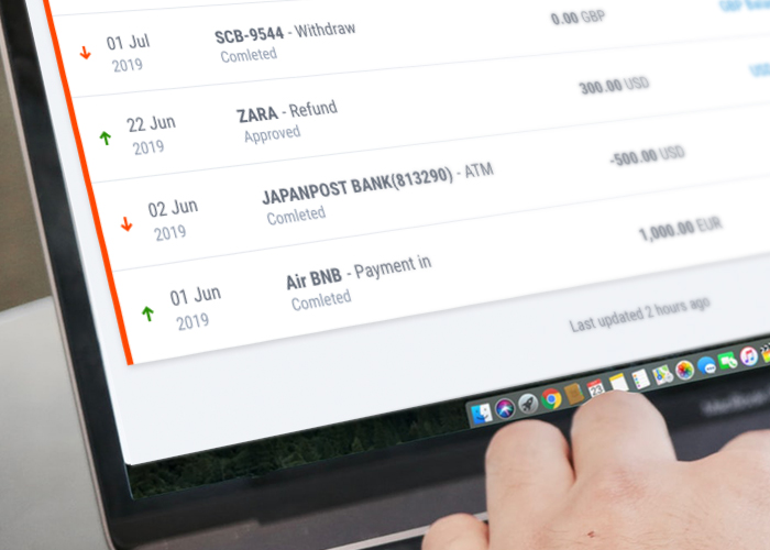
To address this, we’re adding small arrows to better indicate how each transaction influences the balance. This change will be applied in the transactions page and in the new homepage activity widget. We applied this input to other components as well. For example, in the new homepage, when a balance is blocked we’ll added an ‘Account blocked’ message.
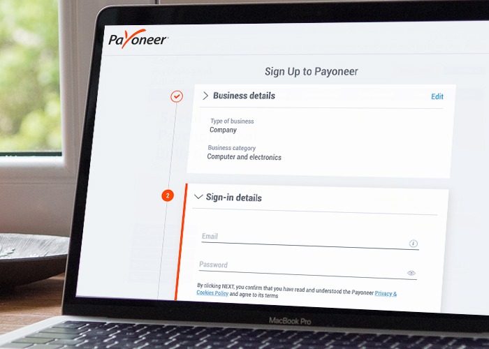
4. Implementing Fake Progress Increases Conversions
Displaying progress when one or more steps are marked as completed can encourage users to finish the flow. We applied this pattern in our new Payer Registration: Users that start the registration process from the Payoneer website will see the first step as completed, since they provide the info for this step in the website. This pattern should increase conversions as users will feel more engaged in the process.
5. Animation is Useful for Maintaining User Focus
Showing animation while we process the user’s information is a great way to keep them focused and engaged to the flow. Animation is an indication that something is happening and gives the user an incentive to wait on the page. Animation can be used to introduce our services and gain client’s trust.
In the new Payer Registration, we use animation to keep users in the flow, while we verify them, aiming to complete their account approval online.
6. Reducing Cognitive Load Leads to Better Focus
In order to properly focus a user’s attention on a page, we need to make sure to present only the relevant information. This means keeping the screen as clean as possible and avoiding any unnecessary distractions.

In the new Edit Profile page we divided the information to 4 different sections, with each section focused on specific data. Users can change their information by editing each section individually. This behavior enables the user to focus solely on the task they need to perform.
7. Web Navigation Education Tours are Great for Highlighting Features
This tool can be used to introduce users to the interface by highlighting important features in the screen, displaying a tool tip with a short explanation about the benefits and usage.
We can can use this tool to announce new features and changes in the UI. We applied this tool to a new page in the customer’s account and mobile app and we will also add it to the new homepage.
Happy designing and see you next time!