


Top 5 Logo Trends of 2019
Editor’s note: This is a guest post by Greg Oprendek, Community Manager at DesignContest.
Like people, brands grow and evolve too. It’s the law of the land that applies to all brands, both large and small.
The difference, however, is that a brand’s logo cannot reinvent itself too often. So, what the cleverest brands do is pay attention to those trends that promise a longer shelf life and can be easily adapted to their current logo design and target audience.
![]()
Speaking of easy, we found that 2019 was all about simplicity along with a definite lean towards clean, modern fonts with a few retro notes woven in.
Let’s explore the top 5 logo trends of 2019 in detail to better understand their significance.
1. Minimalistic Sans-Serifs
Sans-serif logos are classic and loved for their natural simplicity and undeterred elegance. There is nothing about this font that makes it difficult to comprehend, which is why top brands have been using it for years and new ones have positioned it as their go-to font.
Uber’s “bold new brand” uses a custom sans-serif aptly named Uber Move. Although the logo appears simple when taken at face value, the scalability and versatility of the brand’s typography is very powerful. The simple lines of the sans-serif logo allow it to be leveraged in complicated animations as well as in the UI of the Uber mobile app.
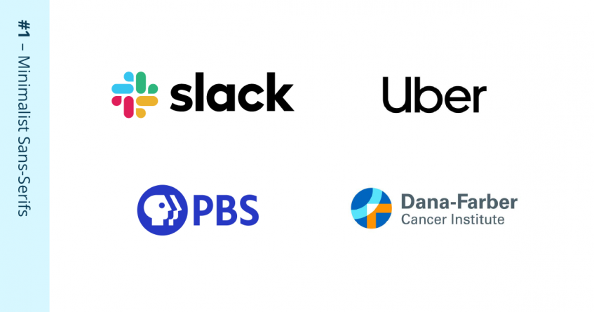
The Slack messaging platform launched a new logo in 2019, after playing around with its iconic hash-tag emblem. The final outcome is a rather unique take but the font that they continue to endorse is a sans-serif that portrays their straightforward, no nonsense stance.
American broadcaster, PBS dropped their old skeuomorphic button look in the past year by switching from a shiny gradient to a more modern, flat design in sans-serif.
Redesigns using sans-serifs aren’t limited to tech giants or household names. The Dana-Farber Cancer Institute also reinstated their mission to transform cancer treatment by creating a fresh logo that combines the ethos of science and empathy. The logomark is unique in that the shape contains a cropped and abstracted version of organization’s initials (DF) in the same sans-serif font.
2. Modern Simplification
The trend to reduce, streamline and infuse clarity into logo designs was evident in the past year. More specifically, we saw brands extract the bare minimum and present us with clean, sharp logos in a contemporary flavor. Welcome to the 21st Century!
Tillamook, the age-old dairy company, upped its identity in 2019 after 70 years of a traditional font, unmistakable wordmark and the Morning Star sea vessel – the symbol of their legacy. They cleaned up the ship, simplified the name with a single script font, and removed its outdated outline. It’s still as rich and luxurious as ever, but in a more up-to-date way.
Hollywood giant Warner Bros launched a new brand identity not long ago as well. Their classic shield has been made more functional for the digital era and the design agency responsible for the re-branding even created a custom typeface for the project.
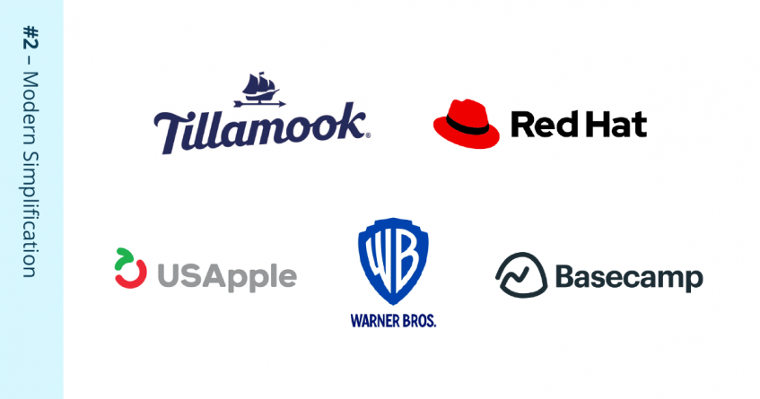
The US Apple Association reconstructed its apple emblem with a simpler design concept so that it represents much more than just the fruit. Now it stands for growth cycles, futuristic goals and advancement, but looks clean and straightforward.
Basecamp, the online project management tool, wiped off the smiley from its quirky mountain logo but kept the structural lines.
Red Hat, the king of open source, further simplified their evolving red top hat symbol to a fresh illustration that they claim is a “redder hat” than ever before, and we would have to agree!
3. Retro Revival
Some brands decided to go back to their roots and refer directly to their oldest logos, which were a big hit in their early days. Modern makeovers to vintage logos are the crux of this trend and, if done right, uses the power of nostalgia and impeccable design to make a big statement.
Reebok turned back time to the 90s and its famous vector symbol. Today, it’s neater, with crisp spacing and alignment that makes it rock with or without the billion-dollar brand name. Speaking of which, they brought it back in the Motter Tektura font and all its glory, complete with the traditional wordmark. This is smart positioning aimed at attracting customers spanning across generations.
![]()
American publishing company, The Atlantic ditched its entire brand name and gave prominence to the single letter “A” in the original Atlantis Condensed font, a rare gem in modern times. Likewise, Grado Labs, the audio brand, drew inspiration from mid-century aesthetics and used the iconic designer Herb Lubalin’s Avant Garde font for their new logo. The designer was inspired by the original logo and redeveloped it with a modern treatment.
4. Bubbly Containers
An unusual yet highly effective trend involves placing a logo into a bubble of sorts to offer it a unique aura. It’s more natural for the human eye to look within an enclosed fencing than a floating word or emblem with no borders. It’s a simple visual trick, and it’s back!
The “W” shaped bubble in which Web Help’s brand resides not only gives it a “wow” factor but also depicts a warmer side to the brand. This visually cute bubble looks like a double heart icon, unusual for a tech-driven brand. But great to catch the eye and get the point across!
The logo for .Monster, a new domain name extension by the XYZ Registry, is oozing with personality, literally! By surrounding the logotype in a bubble container with custom “drips”, this logo stands out among all other logos. By going beyond the typical sans-serif logo, this style of design is clearly fun, friendly and full of creativity.
![]()
The designers of the new Sandwich logo certainly thought “out of the box”. In fact, the logotype is arranged inside of a sandwich silhouette! It begs the question, “why wasn’t this ever tried before?” This logo style is just the first of many.
Action for Children, the UK based Support NGO, highlights their connection with youth by surrounding their name with an idyllic outer space shape. The round corners of the star as well as the friendly script typeface lead to a very endearing and meaningful logo design.
5. Scripts
Apart from the simple sans-serif, we also saw a modern script typeface revival in the branding world this year. The script fonts being used now, however, are modern and appealing enough to catapult a brand to the next level. Long gone are the archaic, illegible fonts that used to be popular on wedding invitations or fancy restaurants. There are script-style options aplenty, including for those with a passion to draw their own. It can be mastered and digitized. Scripts often accompany a basic logo design to give contrast and versatility to the entire brand.
The food brand Jamba (formerly known as Jamba Juice) is all about freshness, and the new logo is just that: fresh and exciting. The script looks natural and handwritten for a high approachability level and depicts an easy flow to good health and happiness.
![]()
When True Ventures launched a new brand identity in 2019, it was to accurately depict the brand as one that focuses on people, makes them feel safe, and yes, makes the world a better place! For this, they mellowed down the entire branding by lowercasing the “T” in “true” and setting the word “Ventures” in a handwritten script that softens the image and better portrays their brand values.
Not Your Father, a “flavored malt beverage” company, combines a bold sans-serif with a customized monoline script in an attempt to make the brand more friendly and appealing. The contrast of the all-caps sans-serif plus the more delicate script is a very fresh take on two major trends this year.
Voiceflow, on the other hand, though a web-based application, has a somewhat lyrical and romantic name to begin with. This is further elucidated with a rolling and fluid script font. The name stands alone with no distracting emblem or design element, which seems enough, thanks to the creative script.
Conclusion
To sum it up, logo designs in 2019 have shown us that simplicity is key and that top brands do not compromise on quality. The modern consumer prefers clean lines, transparency and a human touch that most B2C brands are following.
The best thing about these logo trends is that they are easy to implement and suitable for every platform in the modern world. So, which logo trend is your favorite?
 Greg Oprendek is the Community Manager at DesignContest, the original design contest platform which hosts a community of over 200,000 professional designers from around the world. In addition to tracking industry trends and staying active in the entrepreneurial community, Greg’s passion is to educate startups and small businesses on the importance of design and new domain names.